Packaging is the product of industrialization and social and economic development. It is a marketing packaging designed to cater to the market, guide consumption, and meet people's material and aesthetic needs for commodities. It directly affects consumers' desire to buy, and has the duality of combining commodities and art. So in this issue, let's take a look at the various packaging designs of XCGS Company and what new packaging we have designed for the upcoming Year of the Rabbit.
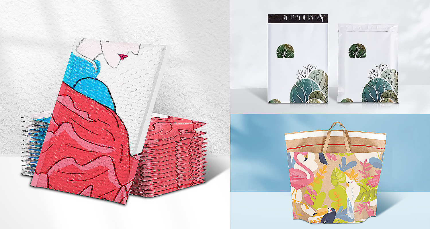
▲NO.1: Strong contrasting colors in the design
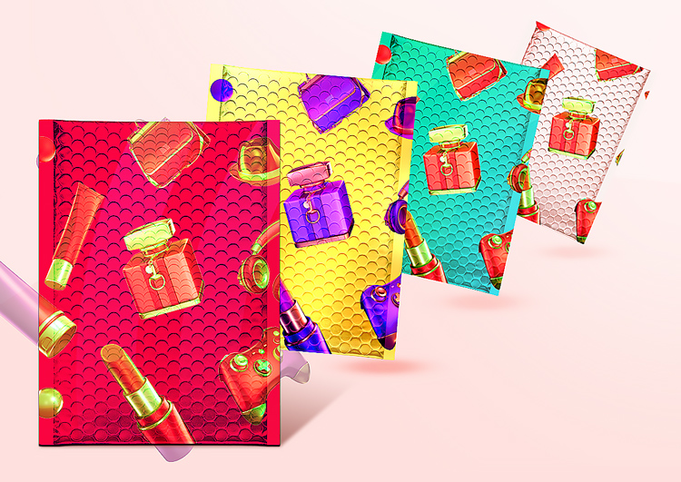
In fact, from the past few years, many packaging designs have used the design direction of contrasting colors. This trend is mainly to use bold and strong contrasting colors to exaggerate the tonality of products. XCGS always encourages bold creativity and leads fashion, so the design of packaging bags uses contrasting color matching, which can produce strong contrast, thus highlighting the impact of packaging in the display effect.
▲NO.2: Asymmetric design
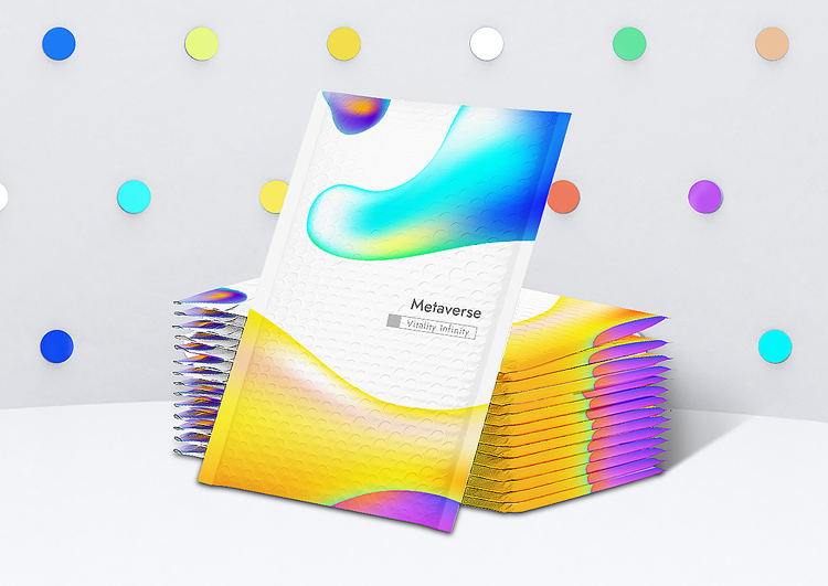
Companies that like moderate packaging design often use symmetrical design methods, which are relatively stable. However, as a company driven by technological innovation and aiming at intelligent creation, XCGS will design through some geometric or 3D renderings in the future. This kind of design is relatively more casual, more dynamic, and will better render the active atmosphere of the package.
▲NO.3: Large font typesetting
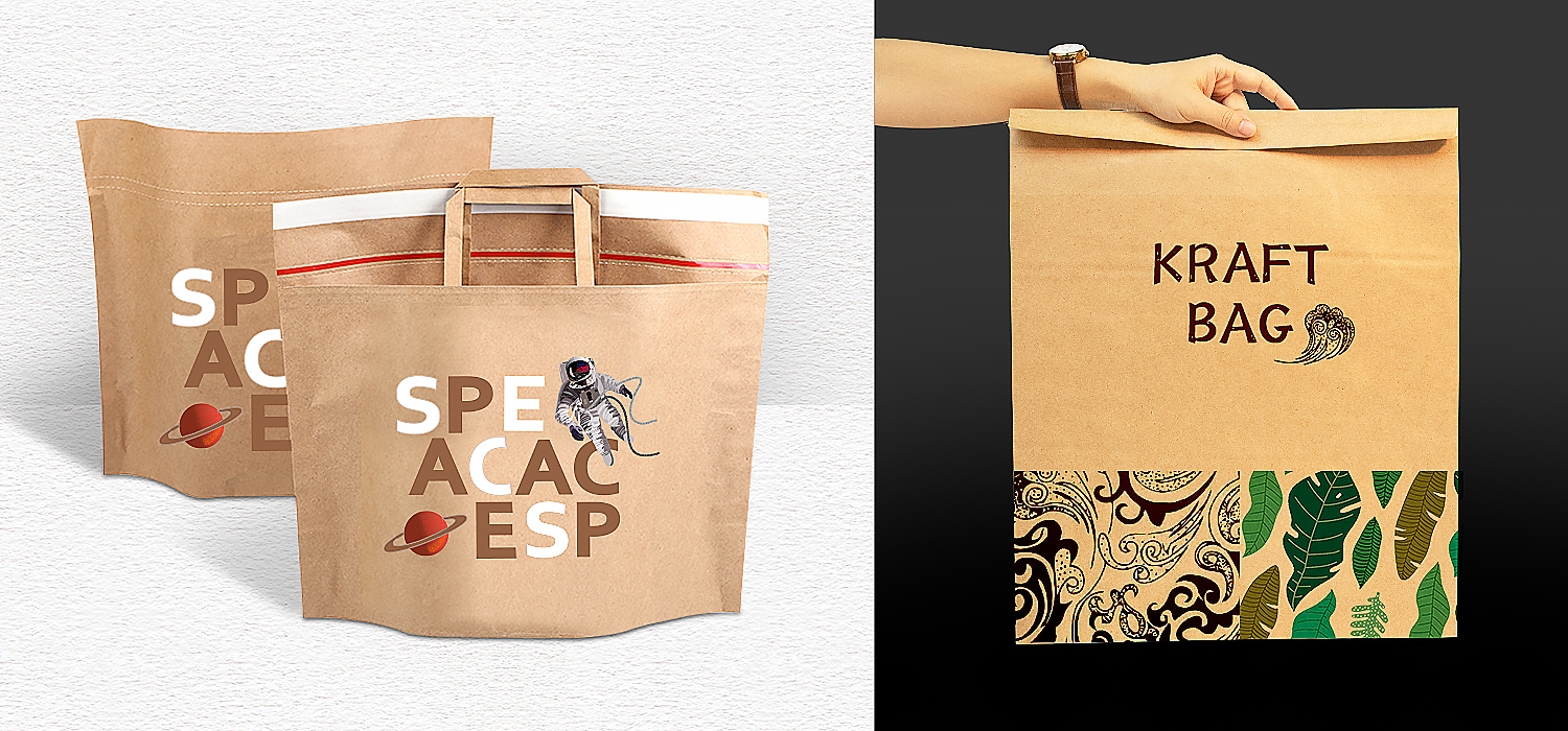
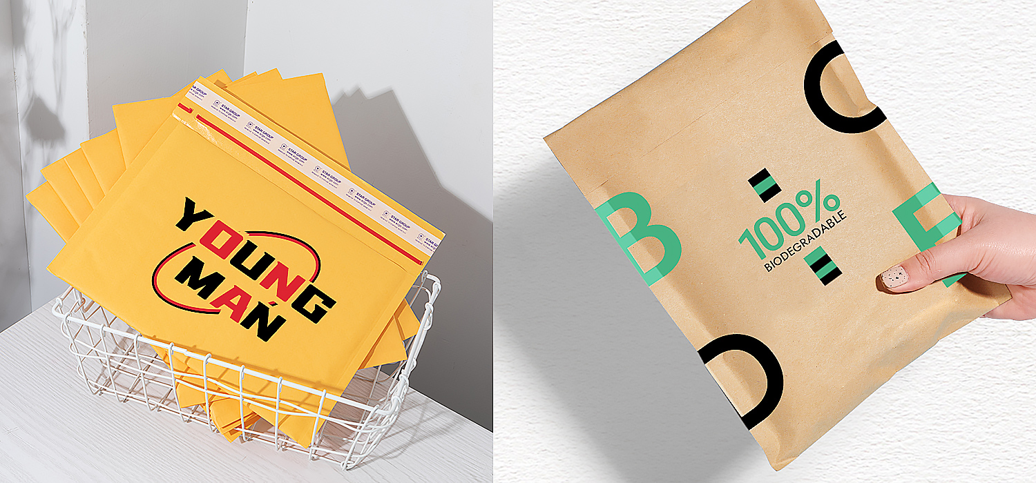
By using the typesetting design of large fonts, the layout effect of large and small fonts can better highlight the core keywords of the product itself, and the product can be fully designed, and then combined with the simplified background and font elements, it can form sharp contrast.
▲NO.4: The use of illustration design
Brands are also increasingly looking for illustrations that are vibrant and stylized to reflect their brand tonality. Unique illustrations and bold colors will make your packaging stand out from the crowd of stock collage masters. Illustration has penetrated into most design fields, and of course illustration is also loved in the field of packaging design.
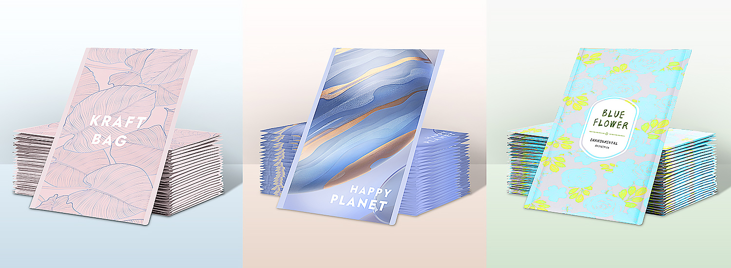
▲NO.5: Shaded Design
Generally, geometric line elements are used to cover the entire layout and makes the design pretty full. The choice of shading should also conform to the positioning of product packaging design culture, and it should also continue the changes in the design concept and graphic extension of the entire brand. The design of shading is generally divided into abstract and figurative forms of expression.After the creativity of graphics meets the requirements of packaging design, the details should also be displayed in place.
▲NO.6: Graphic combination
This composition method is more flexible. The main vision is not composed of an independent main body, but has some scattered elements, text information, picture elements, etc., and finally achieves coordination and unity after the design is arranged.
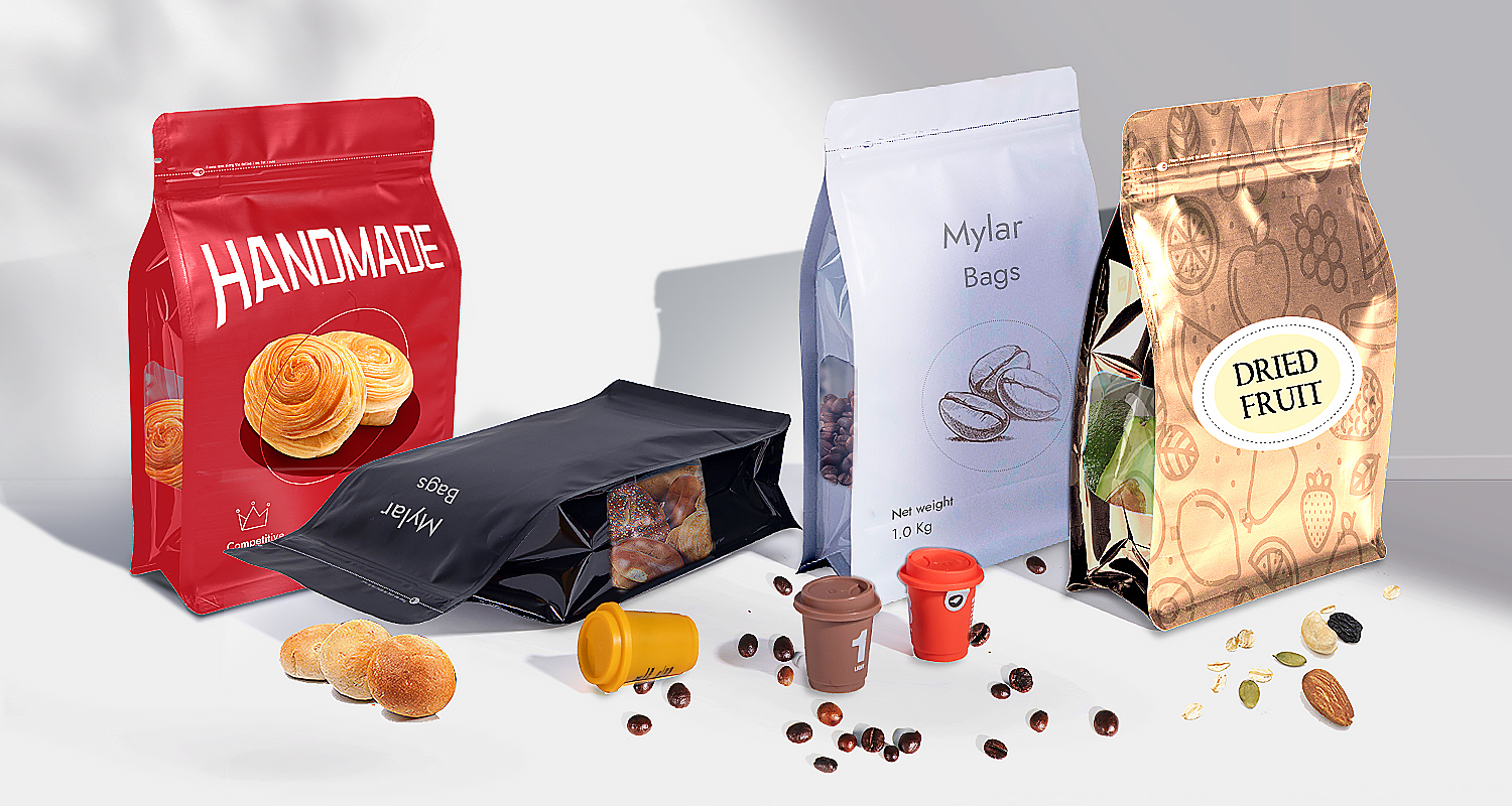
The above is the most popular packaging design of XCGS in 2022, which one do you pick the most! Time flies, and 2022 is gradually coming to an end. XCGS is full of beautiful visions for the upcoming Year of the Rabbit, and has made some special designs. Come and enjoy it!
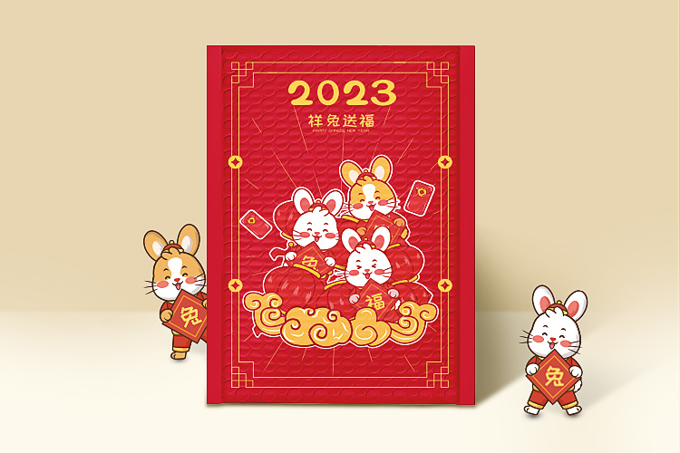
2023 Auspicious Rabbit is sending blessings! The energetic little rabbit stepped on the auspicious clouds and brought red packets to send the most sincere blessings to everyone who received the package. The "cloud" has been regarded as the creation of the holy heaven since ancient times, symbolizing the elevation. At the same time, the cloud pattern has the beauty of momentum, forming a unique feature in the continuous image.
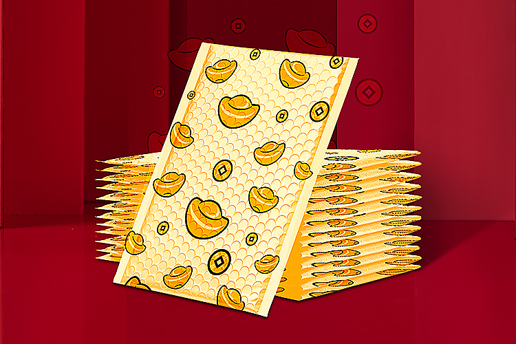
When the Chinese New Year comes, supermarkets, shopping malls and other places will almost always play the well-known song "Gong Xi Fa Cai". In the new year, I wish you a lot of wealth and prosperity! The golden ingot can make the person receiving the package welcome wealth. What could be more popular than this blessing!
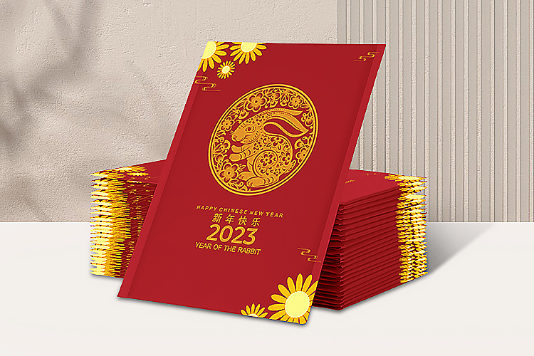
The shape of the "rabbit" element is vivid, cute and highly decorative. In the process of packaging design, the designer recreates the shape of the "rabbit" element by means of balance, segmentation and symmetry, and integrates design emotions to design products that meet product requirements. packaging shape.
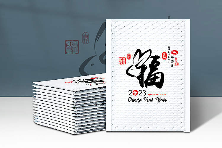
How can the Chinese New Year's wishes lack "Fu"! The large font typesetting makes the word "Fu" stand out, so that the person who receives the package can feel your good wishes for him at the first time.
After seeing so many exquisite packaging, are you a little moved? XCGS can design the packaging structure and pattern design that fit the needs of the product according to the functional requirements of customers. If you have this demand, please contact us, we will serve you wholeheartedly!















 18915559236
 xcbxa@xcgs.com